Logo
A unified communications program is central to our ability to build public awareness of what we stand for and to demonstrate our relevance to people’s lives.
Icon Symbolism
 The logo for UT Health San Antonio was designed to convey the prestigious nature of our organization. It is intended to reflect the trust and high esteem that the university has earned.
Inspired by our official seal. The logo is created from elements of The University of Texas Health Science Center's official seal. Shields have long represented illustrious academic organizations. The shield shape was kept, and modernized, to communicate that we are an academic institution. The star in the center of the shield represents Texas pride.
Taking advantage of the great reputation of the UT System. The logo is in two tones of orange. While this is not the same Pantone Matching System (PMS) color as the UT Austin burnt orange, the colors do have a family connection. We use two tones of brighter orange to make the shield more dimensional.
Born in San Antonio. Our impressive academic pursuits and our forward-thinking research discoveries all start here in San Antonio. With the shape of the Alamo atop our shield logo, we customize the standard academic shield to reflect our connection with our city. We are San Antonio's only academic health center and essential to its economic engine in the bioscience industry. For patients, having San Antonio imagery conveys that we are the health resource for their city. For faculty and students, this recognizes that our world-changing medical advances have all started in this remarkable place.
Communicating Health. While the icon part of our logo conveys that we are an academic health center based in San Antonio, and that we are related to the UT System, the logotype reinforces that we are all about "health." The font is Goudy, which is classic, prestigious and very legible. The word "Health" stands out boldly in our name, to communicate that health is central to our mission.

Logo System
The UT Health San Antonio logo is a combination of the symbol (the Alamo shield) with the logotype (the name of the institution). This is the cornerstone of our visual identity. In logo form the symbol and the logotype should always be spaced and aligned as shown in these guidelines.
Using the logo system in a consistent way results in building stronger awareness for the university, helps distinguish us from other peer institutions and promotes UT Health San Antonio in a meaningful and significant manner. To maximize the impact and recognition of our logo, acceptable configurations and color choices are limited.
The logo should not be recreated from scratch or altered. The consistent use of our logo plays a critical role in the university’s identity system by building greater recognition – throughout the community and the world. Therefore, it must take precedence over the use of any other icon/graphics symbol being used to represent a unit of UT Health San Antonio.
The circle R ® icon represents national registration for our logo and accompanies the logo; the circle R ® icon has replaced the original TM icon found on outdated logos.
Primary Logo
The horizontal format is the preferred primary logotype. To maintain our brand’s integrity, clarity and consistency, the size and clear space around the logo must always be maintained across all forms of communication.
Horizontal Color (Preferred Format)
![]()
Vertical Color
![]()
Horizontal - Greyscale, B&W, Reversed
![]()
![]()

Minimum Size
For most uses, size the logo so that "UT Health" is 2 inches wide or larger.

These specially altered logos for use in small sizes should be used when the width of "UT Health" is less than 2 inches wide. It can never be less than .75" wide.
![]()
Clear Space
Leave a clear space around the logo that is no less than the width of the "H" in "Health". (Occasionally elements can be closer than this, such as on a billboard where the logo needs to be large for legibility.)


Full, Regental Name Logo

Logo for Embroidery
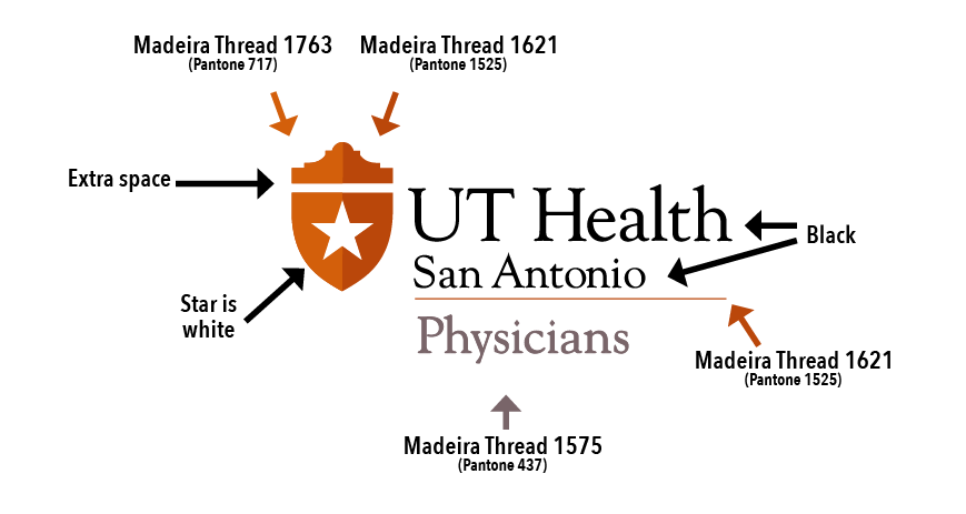
These logos have been altered to maintain the integrity of the logo when embroidered. The type in these logos is thinner than in regular logos, since the threads make the letters thicker when embroidered. The letters in these logos are also spaced out more, so that they do not "plug up" when embroidered. The star is solid white.
Embroidered logos on white coats and scrub tops are 4" in width. Also, because of the smallness of the circle R icon relative to the full layout, embroidered logos do not carry the circle R icon. Please be careful to not pull (vertically) or stretch (horizontally) the Alamo shield icon.
To request an embroidery logo send an email to UTHealthBranding@uthscsa.edu. A prototype sew-out/stitch-out of all embroidery items must be reviewed and approved for quality prior to production of any items implementing the embroidery logo file. Send an email to UTHealthBranding@uthscsa.edu to obtain approval.
Below are the colors of the Madeira thread that we specify be used in all embroidery jobs involving our Alamo-shield logo.
- Madeira Lighter orange thread #1763
- Madeira Darker orange thread #1621
- Madeira Grey thread #1575 is the color of thread that carries the sub-brand name (e.g. Physicians).